
DATA VISUALIZATION, COLOR STUDY
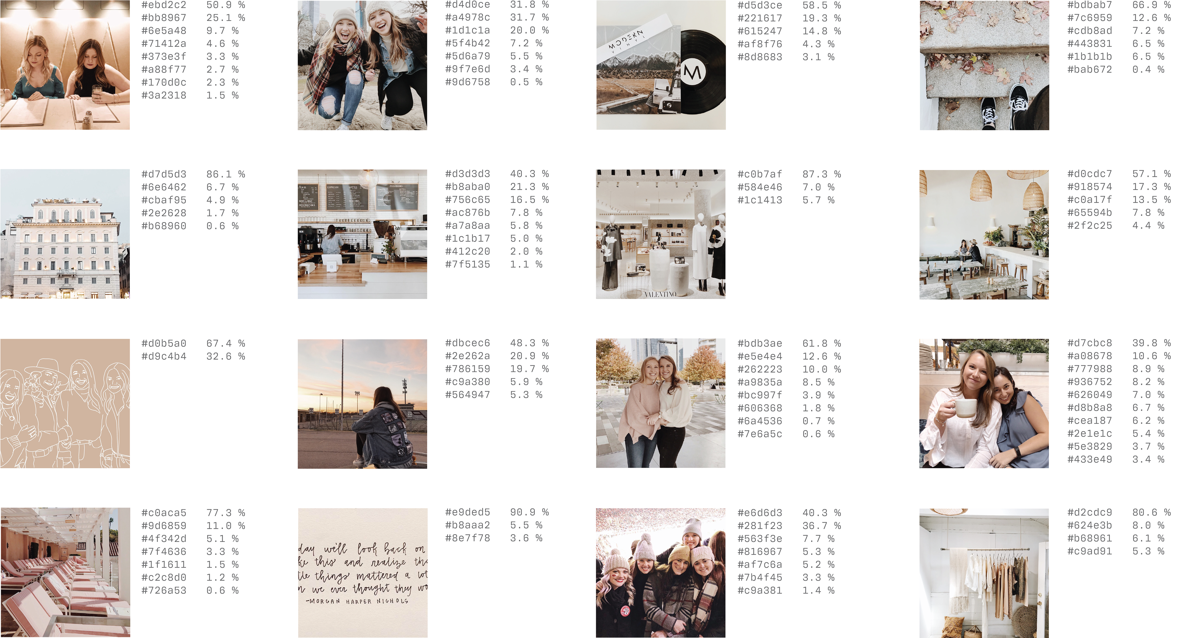
I have a love for neutral colors that seems to carry over into all aspects of my life - the way I decorate my room, the style of my clothes, elements I use in graphic design, and even in the way I edit my photos for Instagram. Using a color extracting app, I gathered the most prominent colors in sixty of my Instagram photos, and I developed a data visualization featuring a lovely rainbow of soft neutrals (the color palette of my dreams!).
I began by using a tool to extract the most common colors of sixty of my Instagram posts. I recorded the hex codes and the percentage of those colors that appeared in each photo.
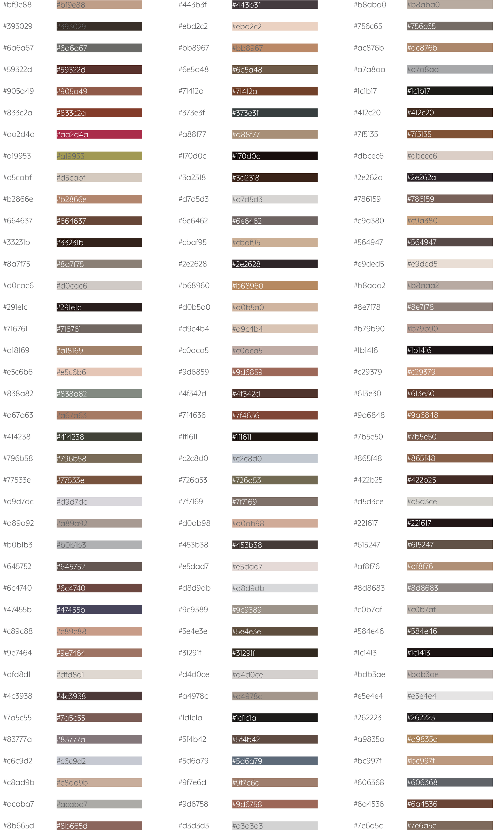
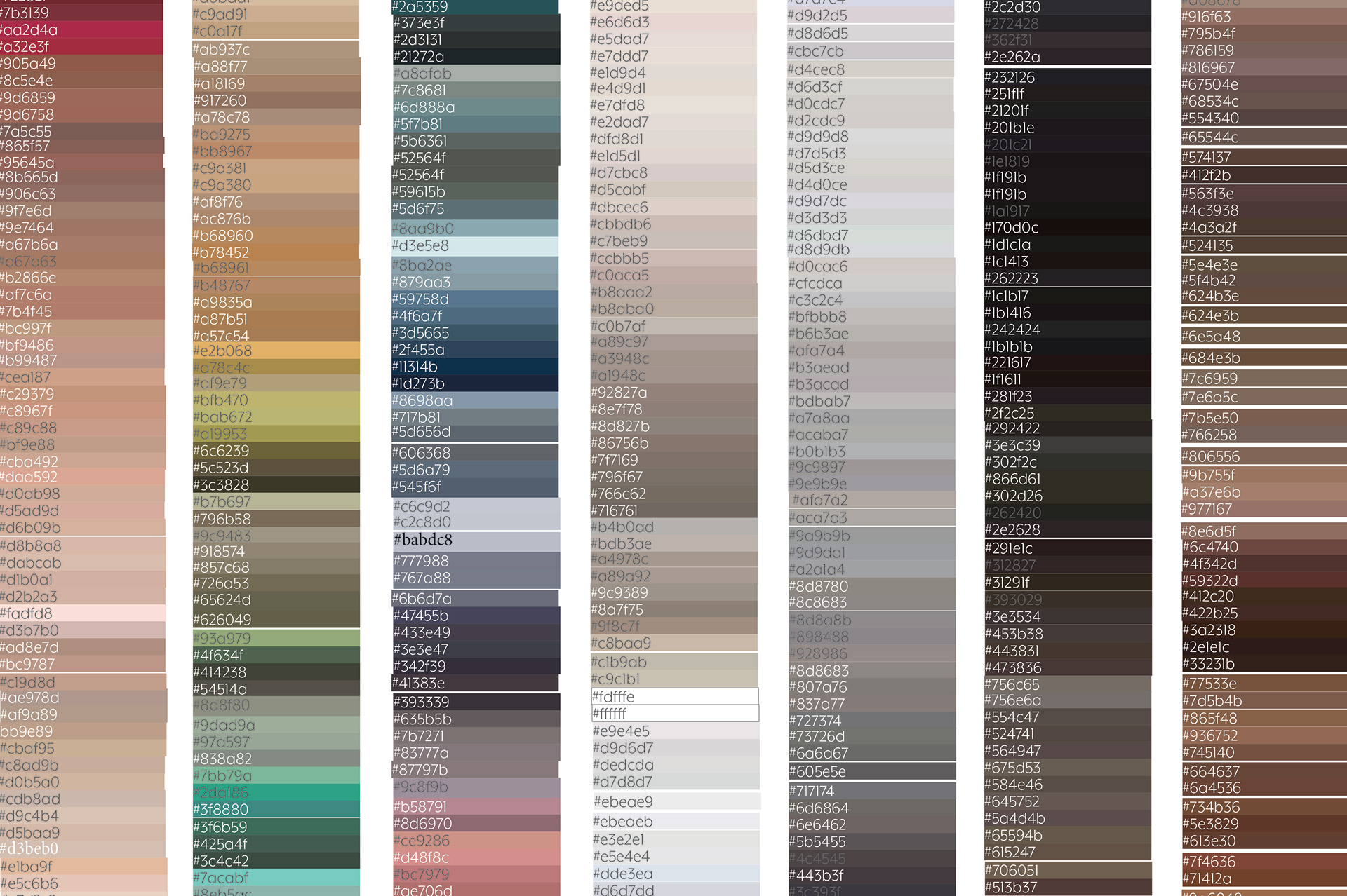
From there, I created a list of all 383 colors I collected, and then (very tediously...) organized them by shade.
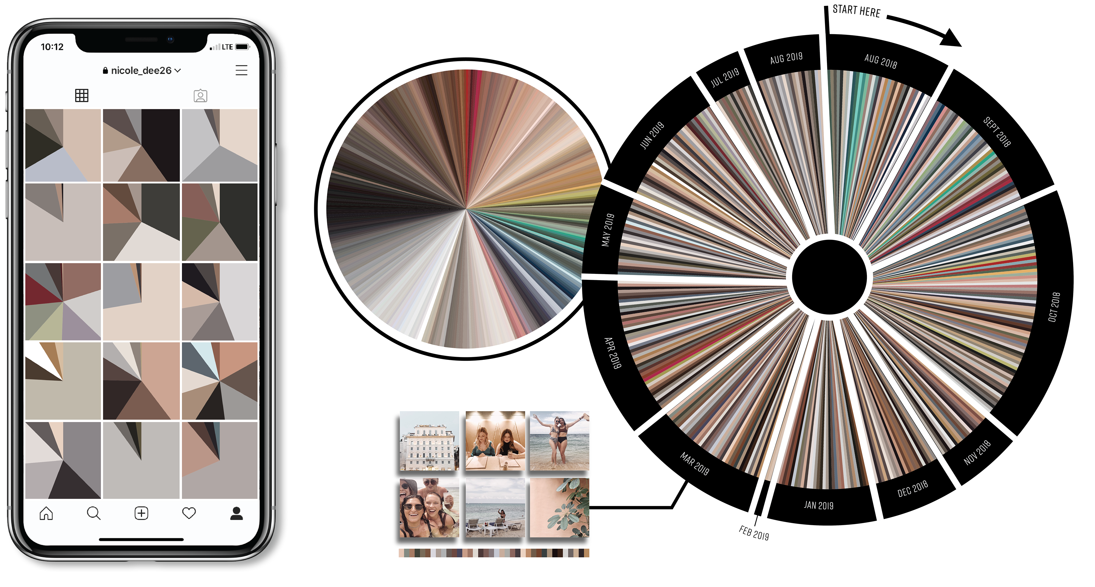
Below you see an array of donut and pie charts. The outer ring on the larger chart shows the months and years when the photos were posted. For example, all of the colors within the bounds of the March 2019 slice came from photos posted during that month of 2019. The inner pie chart shows each of the most common colors from the 60 photos. All 383 of them. In September and August of 2018 we see a few pops of saturated color; those certainly didn’t last too long. The rest of the photos from 2018 and those from 2019 steer towards the land of taupes, grays, and rosy pinks and never turn back. To the left, you see the six photos that I posted in March of 2019 and an isolated view of the colors extracted from those photos. Finally the pie chart to the left of the larger chart is an organized wheel of all of the colors from the 60 photos arranged by their shade. This color wheel makes it a little clearer to see that the colors appearing most often are browns, beiges, grays, and blacks.
The collection of all sixty instagram posts with their most prominent shades:
